Please Click Here to Close
Showing posts with label Preen. Show all posts

A PREEN FESTIVAL DREAM

Posted by Bethan Holt, Junior Fashion Editor at Large


Resort season is in full swing now, with new collections being released every day. Yesterday, Preen designers Justin Thornton and Thea Bregazzi took over the Carlos Room at The Connaught to show off their gorgeous (as usual) Resort collection. In the week when thousands are flocking to Glastonbury, Preen's Resort was appropriately based around the idea of fashion which could take you straight from the office to a festival. Justin told me that they were thinking about conversations they'd had with friends and clients, "They tell us 'I have a meeting but then I'm dashing off to Coachella'. Our customers need clothes to wear in their transient lives". It seems an impossibility to create something that is equally appropriate for boardroom as fields, but somehow the combination of tailored pieces, luxe versions of sporty classics and sweet prints makes it happen.


As ever with Thornton and Bregazzi's work, there were stories and references galore. The most far-reaching is probably the 90s which pops up in various guises throughout the collection. "That decade is so important to us. Then, it was just as much about what Courtney Love was wearing as what Helmut Lang was sending down the runway" Thornton tells me. Love's slip dresses are evoked in the full-length fuchsia bia cut slip in luxurious night time devoré (my personal favourite) and many more floor length, floral dotted skirts. Then there are crop tops and spaghetti straps (but also crisp shirts, a-line skirts and dresses for office times). The key print was a forget-me-not flower- "we love that boys used to give them to girls as a romantic gesture"- but made modern with digital wizardry. All the pops of neon on collars, cuffs and sweatshirt ties are "a bit of rave culture".
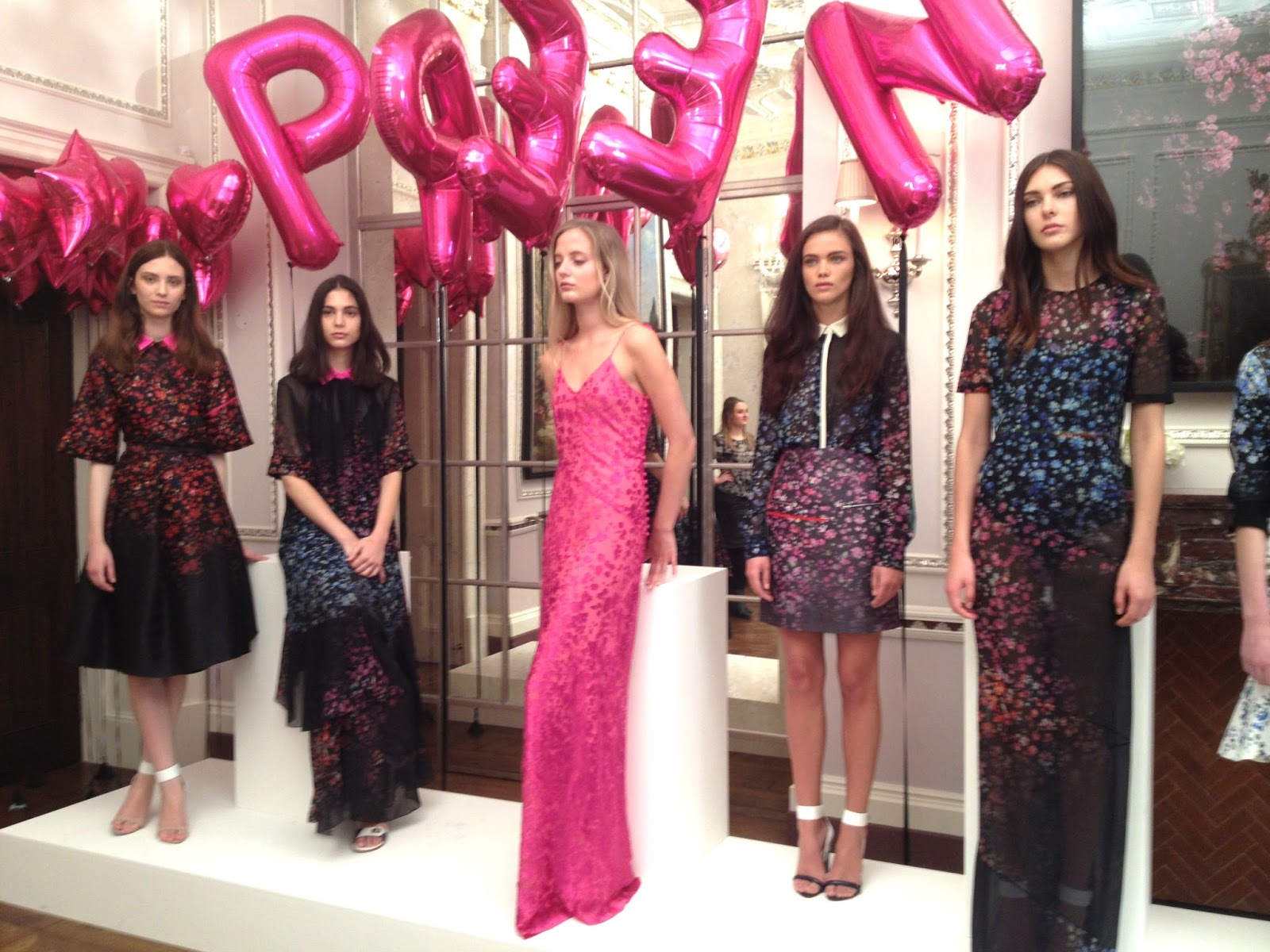


For the first time, Preen have also created swimwear which makes perfect sense for Resort, of course. One set of pieces have been emblazoned with the Preen name, "the first time we've used a logo" says Justin, but a move which ties in with that 90s theme, "they were huge then". Even if you didn't have a pool to show off the swimwear in, I like the idea of wearing it clubbing or, indeed, to a festival as a bodysuit kind of thing. There's a duality to more than just the swimwear. "Sweatshirts have been big business for a while" Justin says, "this time we have them silk fronted and embellished with crystals". Dressed down enough for weekend mooching, dressed up enough to throw on with a mini skirt and take out dancing.

Preen swimwear (via style.com)
Preen planted their own clue to having got this collection bang on. "Balloons are really important to us. If we're looking for an answer, we look in the sky and if we see a balloon then we know it's right" Justin tells me. According to him, it's "sheer superstition'. Looking up in The Carlos Room what did you see? Balloons of course. Whether you're going to Glasto or not, these are clothes we all want to wear. Now.

SS13 AT FRIEZE, ARE GALLERIES AND DESIGNERS TALKING?

Posted by Bethan Holt, Fashion Junior at Large

The Frieze Art Fair has become as much about what those who attend wear as it is about the art itself- well, that's true if you live in my world where pretty much any happening gets a fashion slant. I spent about 3 hours ensconced in the Frieze vastness on Saturday afternoon and I admit that I probably dedicated just as much energy to looking at what everyone was wearing as I did to the art itself. For men, it was all about a Tod's loafer and a tweed jacket and/or cashmere jumper, very Italian. And of course there were plenty of those enduringly popular brightly coloured trousers, may of them corduroy- I spotted mustard, pink, red, cobalt and bottle green. The ladies, as you may have seen from all the features covering Frieze style, were mostly either going for a bright, patterned vintage look or sharp, tailored conceptual pieces from Balenciaga, Celine, Comme et al. But I found that once you began to look, there was fashion in the art. Not just in the sense that there were photographs and paintings of "fashion" but numerous pieces reminded me of the looks I've been poring over from the SS13 catwalk. So, here they are- my fashion/ art Frieze twins.

1. BURBERRY/ PIETER VERMEERSCH

Colour bleed blues...


2. HERMES/ CAETANO DE ALMEIDA

Colourful digi checks...


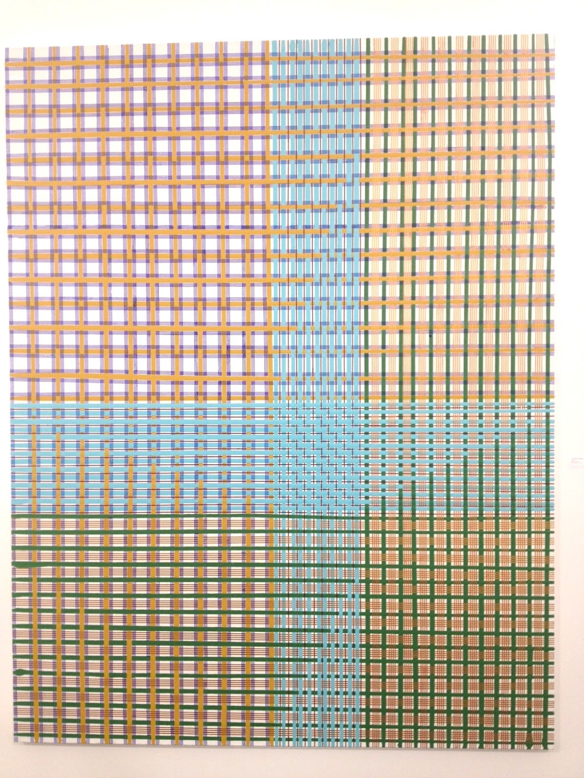
3. PREEN/ DOUG AITKEN

Navy and white big stripes and little prints


4. DIOR/ FARHAD MOSHIRI

Red and pink colour clash


5. SOPHIA WEBSTER/ YAYOI KUSAMA

Colourful dots


6. LOUIS VUITTON/  AKRAM ZAATARI

Marc calls them twins, Zaatari says couples but they both mean two by two. 


All Frieze images by Fashion Junior at Large, catwalk image from catwalking.com

HAVING A STRIPY DAY

Posted by Melanie Rickey, Fashion Editor at Large

Had one of those mornings that was all invoices, accounts, receipts and procedure. So to add some light to an otherwise dark day, I wanted to share one of the trends to emerge from the recent Resort 2013 collections. Stripes aren't exactly the most original of fashion motifs, but I'm totally sold on the way all the designers' I've highlighted here have treated them for their Resort 2013 ranges, especially Balmain and Preen who combined painterly floral motifs with graphic stripes, creating something beautifully fresh. Stripes are, as I've been told time and again by retailer friends, always best-sellers, so going by that factoid alone I expect this won't be the last time we see this little lot.

Balmain

Balmain

Derek Lam

Jason Wu 

Marc Jacobs 

Ohne Titel

Preen

Lanvin

Jonathan Saunders

All photos: style.com

PREEN RESORT 2013: FLOWERS AND STRIPES AND ALL THINGS NICE

Posted by Bethan Holt, Fashion Junior at Large


The first time I met Justin Thornton of Preen was almost a year ago at the presentation of their SS12 collection during LFW. Then, the references I heard were "Virginia Woolf"and "Bloomsbury". For AW12, that continued in a similar vein with Victorian botanical illustrations and Beatrix Potter mentioned as starting points. However, Resort '13 is a turning point for Thornton and his wife, Thea Bregazzi, who together design Preen. This time, it is contemporary artist Jeff Koons whose work has inspired the (amazing) collection which "should make people excited about Summer and holidays, whether they're going away or not" Thornton told me yesterday.

Blown up flowers on paint splash backgrounds at Preen Resort

Jeff Koons' Landscape (Waterfall) II (from www.jeffkoons.com)

Jeff Koons' Landscape (Tree) II (image from jeffkoons.com)
Florals have not been abandoned but there's definitely a new, graphic boldness to them. There are overblown hydrangeas and poppies, splashed in bright, popping scarlet, magenta and cornflower blue. However, they're foregrounded against bold, wide stripes which takes away any English country garden connotations.

"Many of our customers are in Australia or the Middle East, so this collection isn't about going on holiday for them" Thornton explains. Thus, there are all the pieces which make up a practical wardrobe- a pencil skirt, sweaters, riffs on the white shirt and excellent colour blocked suits which "came from the idea of a 70s tracksuit". Sportswear features heavily; there are 3 different sweatshirts in the mix.  The cropped style has sold very well so far I was told but my personal favourite was the scuba version below.
My favourite....the scuba sweater
Tailoring inspired by 70s tracksuits (image from style.com)
And a final tip from Mr Thornton on arm shapes "we're really feeling a wide, kimono sleeve. It's very 80s and just so easy". See white shirt below for evidence- you heard it here first. 
Preen's new favourite arm shape
Flowers and stripes


All images by Fashion Junior at Large, unless otherwise indicated.

THE BRITISH DESIGNERS COLLECTIVE IS COMING TO BICESTER

Posted by Bethan Holt, Fashion Junior at Large

Bicester Village is a firm fashion favourite. In case you're not aware, this little designer shopping haven just outside Oxford is home to outlet boutiques from labels like Celine, Prada and Marni. The stores are almost as heavenly as the Bond Street versions but the merchandise is discounted by up to 60%. The British Designers Collective is the result of a collaboration between Bicester Village and the British Fashion Council. It is giving some of our best British designers the opportunity to get in on the Bicester Village action. Yes, that means discounted Peter Pilotto, Osman, Preen, Jonathan Saunders... the list is long and very, very exciting.

The Great Hall will house The British Designers Collective 2012
In two weeks time, on March 21st, the British Designers Collective will open its very chic doors for the third year and FEAL will be there! In the mean time, we'll be giving you a few tasters of what to expect. As you well know, we are big supporters of our amazing British designers who work and show in London. Now that they're giving us the chance to snap up their pieces at a reduced price, it would be rude to refuse wouldn't it? And if there any guys reading, then we have good news for you too because in May the collaboration will launch its first ever Menswear selection- James Long, Grenson, Margaret Howell and Sunspel are just a smattering of the labels which will be on offer there.

Pieces from previous seasons will be available at the
British Designers Collective, like this from Osman AW11

Or this from Preen AW11
We'll be keeping you posted on all the Bicester action in the coming weeks with interviews with some of the designers which will be available plus news from the launch.

The full list of womenswear designers- Nicholas Kirkwood, Preen, Osman, Marios Schwab, Jonathan Saunders, Markus Lupfer, Peter Pilotto, Holly Fulton, Bella Freud, James Long, Goat, Emma Cook, Hermione de Paula and Jean Pierre Braganza plus accessories from Pauric Sweeney, Lily and Lionel, Mawi and Erikson Beamon.

HOW WILL YOU WEAR YOUR GUIPURE?

Posted by Fashion Junior at Large

Lace is nothing new on our fashion radar, in fact it is rarely off the agenda. For next Spring/Summer, there is a particular sort of lace which we have been seeing again and again on the catwalks. Let me introduce you to GUIPURE. This is a chunkier lace than the flippety, delicate pieces we might be used to. The technique for creating it is thought to originate from darning onto fishing net, which will give you some idea of the sturdier nature of this lace in comparison to, for example, a chantilly. The word guipure means a thick cord over which thread is twisted; guiper can mean 'to wrap' en francais. 


Thakoon SS12 
 Throughout New York and London, we heard the word guipure enough times for it to stick. And then Miuccia Prada used it as an overlay throughout her collection. This cements guipure's status as a key texture for SS12. It is also highly versatile- it can be used as a trim (as on hems at Clements Ribeiro), an overlay (see Thakoon and Prada) or in an entire garment (see the Preen pencil skirt below). We've also seen designers (like Clements Ribeiro's dress below) take the guipure lace pattern and print it onto garments. This achieves the same balance of prettiness and chunkiness with the fussiness of dealing with the lace itself. So, there is clearly no one way to work your guipure- we're excited to see its many manifestations next Spring/ Summer.
Clements Ribeiro SS12

Prada SS12

Prada SS12

Preen SS12
I cannot confirm that this IS guipure but it looks a lot like it to me, trapped between layers at Simone Rocha SS12

All images from catwalking.com

PREEN AT LFW SS12

Posted by Fashion Junior at Large

I've just got back from the Preen presentation and am in love. You'll know from my post the other day that Preen was mine (and as sarah Mower told the Fash Ed yesterdays, her) highlight of NYFW so it felt like a real privilege to be able to view the collection up close this morning.


I also spoke to Justin Thornton, designer at Preen alongside Thea Bregazzi. I had seen that the collection was inspired by Virgina Woolf  but I knew that this was no straightforward copy of Virginia's 'look' as that would have involved drab dresses and dull colours. Thornton told me that Woolf's seminal novel Orlando,  which charts the adventures of the epnonymous protagonist as he (then she) lives through a number of times and places (that is a very crude synopsis!) was the central starting point. Ultimately it was the element of reincarnation which the Preen team took as their spin on the Virgina Woolf theme.
Frills and peplums were subtley pretty

Virginia Woolf circa 2012

Lots of great tailoring underpinned this collection - and excuse me, how great is this shade of yellow?
Thus, this collection brings Woolf into SS12 so that this does not look like another rehash of the 20s and 30s which really, with that theme it could so easily have been. Instead it feels precisely of the moment with details which reflect those historical references; the lemon shade which is accented throughout came from a recurring reference to this colour from the botanical writings of the time, the frills at the wrists reflect the fact that Woolf would always have a handkerchief tucked up her sleeve.
Frills for hankies
 The botany theme is also reflected in the digitised prints which were created from an intial scan of a peony. There is also an enlarged lace print which came from a contemporary sample. I also noticed that there were lots of back details in the collection, particularly cut-out shapes or alternate colours and fabrics- my favourite example of this is the white dress with fuschia chiffon pleating on the back.
Bloomsbury print- ladylike but then sexy with a midriff- perfect combination
Stunning back detail
Thornton told me that a collection which is made up of quite simple silhouettes, as this one is, lends itself to transforming the look from front to back. Midriff and back baring feel very modern he commented- a sentiment which many designers are picking up on and so interesting to see the varying interpretations.This is a collection full of favourites... I couldn't choose one piece.

The sequins were originally going to tie in with the graphic element of the digitised print but it was then decided to make them more scattered for a contrasting effect. The work was done by hand in India.


This guipere lace top is cut out at the back, and lined in fluror pink as you can see in the shot above. From prim to modern sexy in one about turn. 


Photos: Fashion Junior at Large
Related Posts Plugin for WordPress, Blogger...

Copyright © Arty Farty Fashion Party

Template By: Arty Farty Fashion Party Sponsored By: Free For Download Themes